
Prof Benjamin Hennig
Professor of Geography at the University of Iceland and Honorary Research Associate in the School of Geography and the Environment at the University of Oxford. He is also involved in the Worldmapper project.
Email: ben@hi.is
X: @geoviews

UK Election 2024
Section 2: Voters, polls and results
13. Forecasting a multiparty majoritarian election with a volatile electorate (Dr Hannah Bunting)
14. The emerging infrastructure of public opinion (Dr Nick Anstead)
15. A moving target? Voter segmentation in the 2024 British General Election (Prof Rosie Campbell)
16. Don’t vote, it only encourages them? Turnout in the 2024 Election (Prof Charles Pattie)
17. Cartographic perspectives of the 2024 General Election (Prof Benjamin Hennig)
18. Gender and vote choice: early reflections (Dr Ceri Fowler)
19. Changing Pattern amongst Muslim voters: the Labour Party, Gaza and voter volatility (Dr Parveen Akhtar)
20. Religion and voting behaviour in the 2024 General Election (Dr Ekaterina Kolpinskaya, Dr Stuart Fox)
21. Failure to connect: the Conservative Party and young voters (Dr Stephanie Luke)
22. Youthquake for the progressive left: making sense of the collapse of youth support for the Conservatives (Prof James Sloam, Prof Matt Henn)
23. Values in the valence election (Prof Paula Surridge)
24. Tactical voting: why is it such a big part of British elections? (Thomas Lockwood)
The 2019 General Election saw Boris Johnson’s Conservative Party achieve a sweeping victory in Labour heartlands. However, subsequent political upheavals led to three different Conservative Prime Ministers within the same parliamentary period. Despite this, the political map of the UK remained largely unchanged as this all happened within one parliamentary period. When Rishi Sunak, the most recent Conservative Prime Minister, called for a general election, it marked a significant moment to reassess the UK’s political geography. Influenced by years of Conservative infighting, the electorate responded with a landslide victory for the Labour Party under Keir Starmer’s leadership that led to a visible change of the political landscapes.
This cartographic analysis uses three primary types of visualisations to assess these changes: geographic views, constituency views, and population views. Each offers distinct insights for a comprehensive understanding of the election results and their geographic distributions.
The geographic maps present data based on actual locations, illustrating where parties have won and the geographical distribution of political support. They highlight regional voting trends and the impact of geographical factors on election outcomes. These maps are intuitive as they correspond to real-world locations, making them easy to understand for most readers through familiar regional boundaries. They relate election results to physical geography, aiding in comprehending how local issues influence voting behaviour. Geographic views quickly communicate areas of strong support or opposition.
British audiences are almost equally used to a second type of election maps which are labelled constituency maps here. They are widely used in the broadcast media during election night and are also prominently featured in print. These maps (also known as cartograms) display each constituency as a uniform unit – here a hexagon – avoiding spatial distortions from varying constituency sizes. They emphasise the distribution of votes and party support without the visual bias of large, sparsely populated areas. These maps reflect the equal weight of each vote, crucial for understanding the true distribution of political support. By equalising the area of each constituency, these maps make it easier to identify patterns and compare different regions and how this relates to the actual share of seats in Westminster.
The fairest representation of election results, however, are shown in the third type of maps included in this analysis. This ‘Population views’ is another form of a cartogram, here scaling geographic areas to reflect their actual population size, emphasising regions with more voters and reducing the appearance of rural areas. They highlight the significance of urban areas where a large proportion of the population resides and votes. These cartograms show the actual impact of votes, clarifying how densely populated areas influence election outcomes. They balance the visual impact of large, sparsely populated areas and small, densely populated ones, offering a more accurate representation of voting power.
This analysis includes a series of maps that go beyond simply depicting the winning party in each constituency, including the second placed candidates in each constituency, the Labour and Conservative vote share as well as those of the remaining parties combined, and the overall turnout.
While the first-past-the-post system often produces clear results, Labour’s historic 412-seat majority with only 33.7% of the vote share was remarkable even in this context. Even during Tony Blair’s 1997 victory the election maps did not reveal such a geographic spread of seats as shown in these maps. But the geographic patterns also reveal more complex trends of voting behaviour. Examining the performance of second-place candidates provides valuable insights, as many constituencies were won by narrow margins, highlighting how minor vote differences can significantly impact the overall outcome. The rise of smaller parties is particularly noteworthy, with 42.5% of votes cast going to parties other than Labour or Conservative. Additionally, the election saw a historically low turnout of just 60 %, over 7% down to the 2019 election and the lowest in over two decades, indicating voter disillusionment with politics in many parts of the country. In wide parts less than half the electorate decided to go to the polls in the first place.
The 2024 General Election has significantly reshaped the UK’s political landscape. The geographic patterns revealed in these maps show that while Labour achieved a landslide victory, Keir Starmer’s parliamentary majority remains fragile. The trends that emerge in these maps are unlikely to remain stable until the next election. The rise of the smaller parties demonstrates that they, too, can achieve success within the British electoral system, raising questions about the dominance of the major parties in future elections.
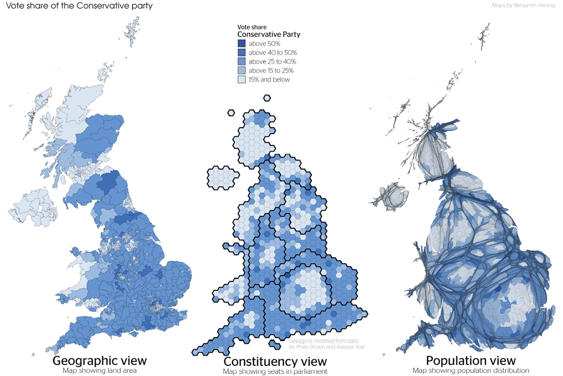
Figure 1: Vote share of the Conservative party
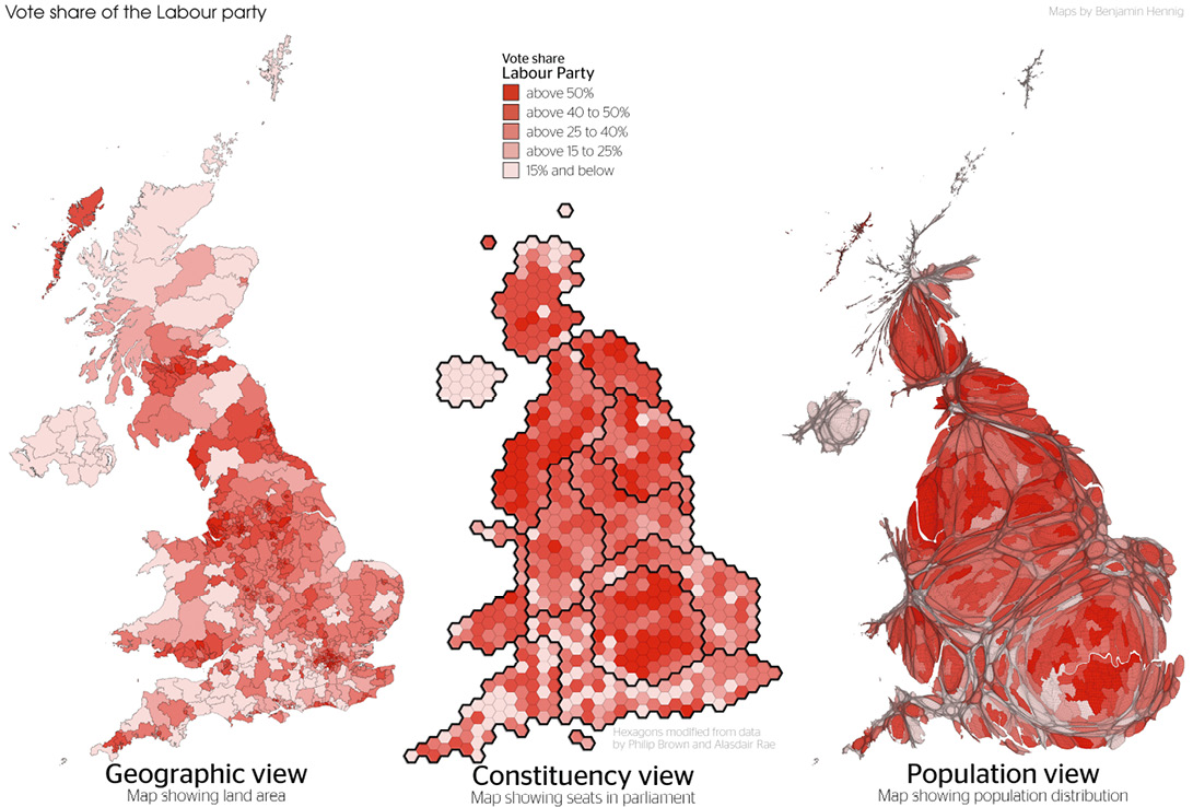
Figure 2: Vote share of the Labour party
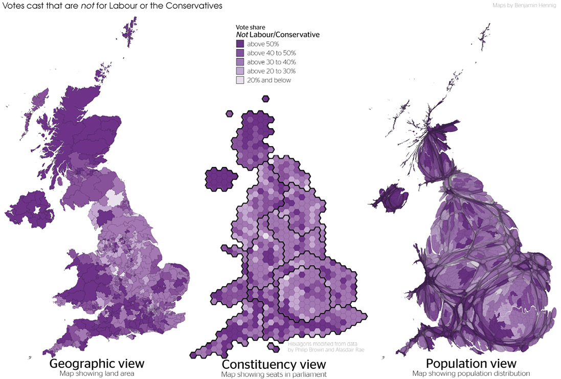
Figure 3: Votes cast that are not for Labour or the Conservatives
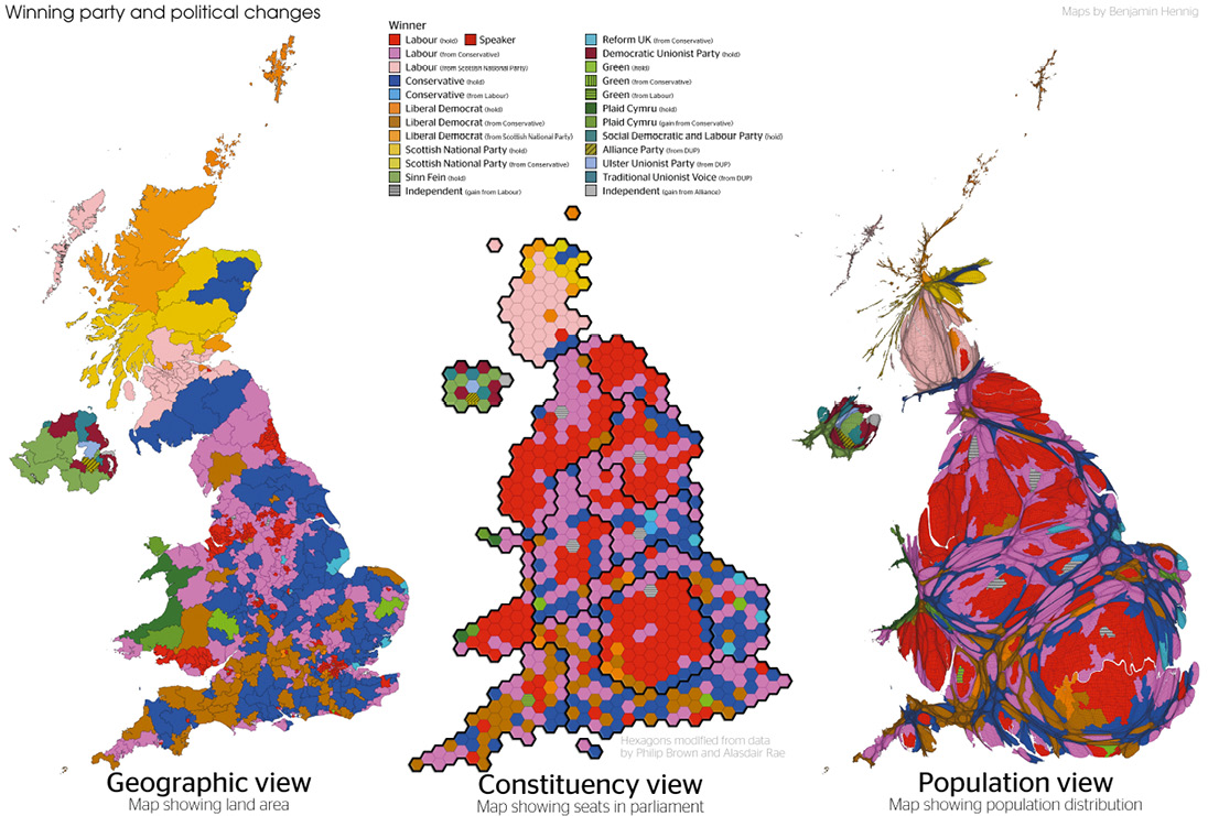
Figure 4: Winning party and political changes
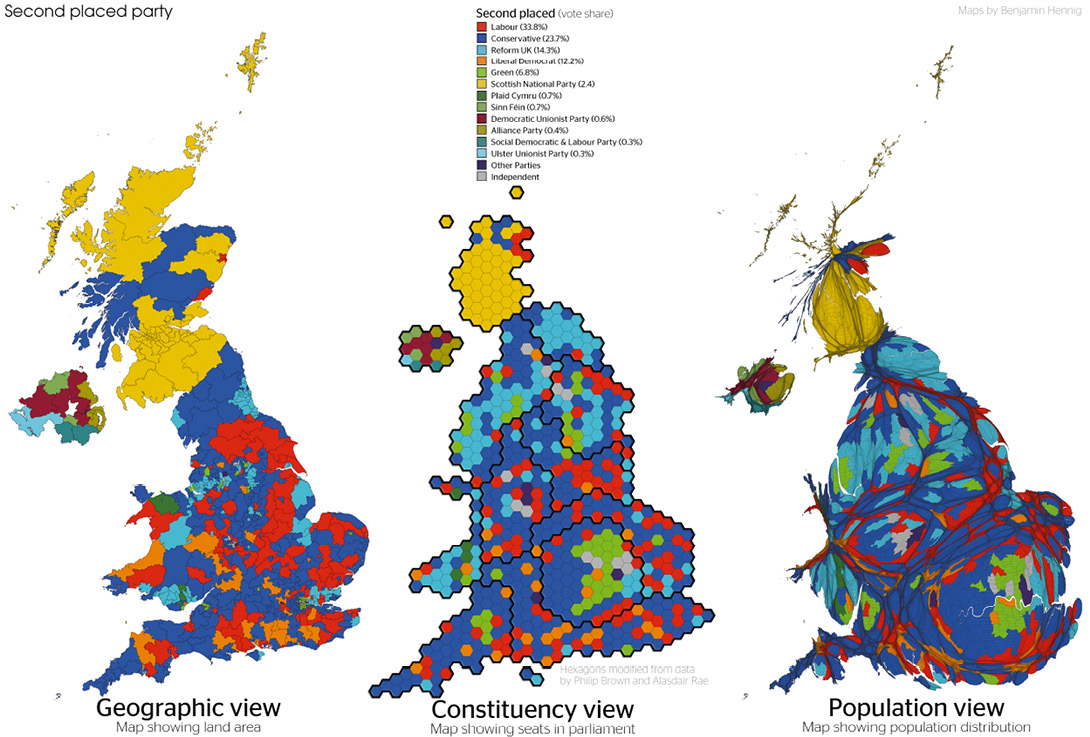
Figure 5: Second placed party
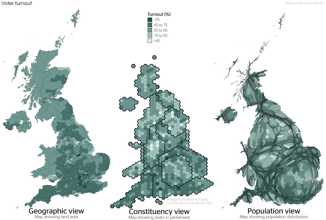
Figure 6: Voter turnout