
Paul Bradshaw
Leads the MA in Data Journalism at Birmingham City University and works as a consulting data journalist with the BBC Shared Data Unit. Publisher of the Online Journalism Blog and has written over 20 book chapters and research papers on online journalism, including the Online Journalism Handbook, Mobile-First Journalism, Scraping for Journalists, Finding Stories in Spreadsheets, Snapchat for Journalists, and the Data Journalism Heist.

UK Election 2024
Section 7: News and journalism
73. Why the press still matters (Prof Steven Barnett)
74. When the Star aligned: how the press ‘voted’ (Prof Dominic Wring, Prof David Deacon)
75. Visual depictions of leaders and losers in the (still influential) print press (Prof Erik Bucy)
76. Towards more assertive impartiality? Fact-checking on BBC television news (Prof Stephen Cushion)
77. The outsize influence of the conservative press in election campaigns (Prof Dan Stevens, Prof Susan Banducci, Prof Ekaterina Kolpinskaya and Dr Laszlo Horvath)
78. GB News – not breaking any rules… (Prof Ivor Gaber)
79. Vogue’s stylish relationship to politics (Dr Chrysi Dagoula)
80. Tiptoeing around immigration has tangible consequences (Dr Maria Kyriakidou, Dr Iñaki Garcia-Blanco)
81. A Taxing Campaign (Prof David Deacon et al)
82. Not the Sun wot won it: what Murdoch’s half-hearted, last-minute endorsements mean for Labour (Dr John Jewell)
83. Is this the first podcast election? (Carl Hartley, Prof Stephen Coleman)
84. A numbers game (Prof Paul Bradshaw)
85. Election 2024 and the remarkable absence of media in a mediated spectacle (Prof Lee Edwards)
86. 2024: the great election turn-off (Prof Des Freedman)
What do data journalists write about when an election result appears to be a foregone conclusion? That was the challenge that reporters in the field faced during the election anti-campaign of 2024.
The answer for some was to skip to the end (“Brace for the most distorted election result in British history”) and focus on live election prediction services.
For others, it was an opportunity to look back: The Manchester Evening News looked back at 14 years of Conservative rule in the city, while the Guardian went all-out with a six-story retrospective series. The Economist explored “The inheritance awaiting Britain’s next government” and the FT’s John Burn-Murdoch led his last opinion piece before the election on “How the Conservatives came to the brink of wipeout”. Stories that would in any other year have been planned for the post-election review were brought forward by weeks.
Between those extremes, the biggest data scoop of the campaign was the revelation by the Telegraph and FT of a spike in bets on a July election before it was announced. Both titles were able to identify the spike thanks to the availability of data on betting patterns. It was a landmark moment for data journalism: where normally the actions and words of politicians on the campaign trail make election headlines, this was a rare case of a set of numbers other than polling figures feeding the news agenda (although only after the initial allegations and investigations had begun).
But this was an exception. For the most part (aside from the Guardian’s story establishing the scale of contracts given to companies linked to Tory donors), data journalism teams did little to set the news agenda, and the vast majority of data journalism output treated the election as a numbers game. Electoral Commission data on donations was scrutinised; Meta and Google’s political ad data and open source information provided an insight into tactics; and TikTok performance provided a rich seam for measuring engagement — but the focus was on money and strategy, rather than voters and issues.
Look across the stories produced by the major outlets during this period and what is striking is the almost total absence of voices outside of the Westminster bubble — or indeed any voices at all: of over 50 articles with data journalist bylines published during the election campaign, more than half had no original quotes at all. When people were quoted, they tended to be politicians or party spokespeople.
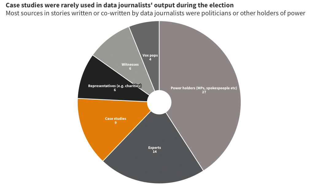
Exceptions in this landscape were notable: The Times’s Tom Calver’s feature on millennial voters stands as an exemplar of what a good data journalist can do: driven by a human case study, it manages to paint a rich and subtle picture of the issues concerning a particular group of voters. It was one of only four stories in my sample which quoted any case study who wasn’t a politician (the others were a BBC England Data Unit piece on the cost of living, its investigation into rent, and the Manchester Evening News’s triple-bylined retrospective).
Some of the limitations in the coverage can be blamed on the foregone nature of the contest and the defensive nature of the two biggest parties’ campaigns — but it is not just the responsibility of politicians to put issues on the agenda. The BBC England Data Unit had a clever way of hooking one data-driven housing investigation by leading with the scale of private renting’s rise since the last general election.
The lack of voices can also be partly blamed on the quick-turnaround formats that data journalists were able to fall back on: mapping of changing boundaries is purely informational — but can it be done without the people living there remaining voiceless? Factchecking of Facebook adverts is a worthy watchdog activity — but would it be more engaging to report why it matters? Can we bring charticles to life with quotes?
But perhaps the most interesting cause of the lack of diversity in voices and subject matter might lie in the nature and status of political reporting, and what happens when data journalism is pulled into its orbit.
We’ve been here before: during the coronavirus pandemic it was political reporters who were sent to the daily coronavirus briefing, rather than health and science specialists, contributing to suspicions of ‘gotcha’ journalism. When it came to the 2024 Election, was there a similar dynamic that saw ‘horse race’ reporting driving data journalism and other opportunities were missed?
Take the story about Rishi Sunak’s tax figures: this was a story ripe for the skills of data journalists, who could have created interactive calculators, or explainers about the government’s own historic taxation, or looked at the real world impact of tax. Yet none of these things happened. Instead, the story quickly became a routine Westminster story of claim and counter-claim.
Did voters simply believe the side they supported? Were they persuaded by critical statements? Could an interactive approach such as the New York Times’s ‘You Draw It’ format have been more effective in engaging audiences with a truth they were less prepared to believe? Initial research suggests so. More research is needed.